


 Home
HomeThe Art of Mixing Materials: Finding the Perfect Balance Between Wood Grain and Solid Color PET Surfaces
 06 Jun,2026
Walk through any premier international furniture exhibition this year, and a distinct visual language emerges. The era of monolithic cabinetry—entire rooms wrapped in a single, uninterrupted material—has quietly passed. Instead, leading architects and interior designers are exploring the nuanced interplay of surfaces, specifically the deliberate pairing of organic textures with engineered, light-absorbing colors.
This shift toward material layering in furniture design is not merely aesthetic; it is deeply psychological. By contrasting the unpredictable beauty of natural wood textures with the controlled, flawless expanse of a matte surface, designers create spaces that feel both grounded and sophisticated. Advancements in surface technology, particularly the evolution of PET surface solutions, have moved this design strategy from custom, high-budget architectural projects into mainstream modular furniture collections.
Why Pure Wood Grain Is No Longer Enough
For decades, wood texture represented the pinnacle of premium furniture. However, as residential floor plans shifted toward open-concept layouts, continuous walls of heavy wood grain began to overwhelm spaces. A kitchen that shares sightlines with a living and dining area demands a more restrained approach to visual weight.
Modern cabinet color combinations require a visual break. When designers mix and match cabinet colors, introducing solid blocks of color next to wood textures, they provide the eye with a place to rest. This intentional breaking of patterns elevates the perceived value of the cabinetry. The organic movement of a wood grain PET film suddenly feels more intentional—more like a curated architectural element—when framed by the quiet confidence of a solid color PET film.
Furthermore, consumer preferences have aligned with warm minimalist interiors. Homeowners are actively rejecting spaces that feel overly sterile or excessively rustic. They seek a middle ground: the warmth of nature anchored by the clean lines of contemporary furniture design.
The 70/30 Rule Used by Many Designers
Achieving visual balance in cabinet design requires structural discipline. When combining wood and solid color cabinets, seasoned designers frequently rely on the 70/30 ratio. This framework prevents materials from competing for dominance, establishing a clear material hierarchy.
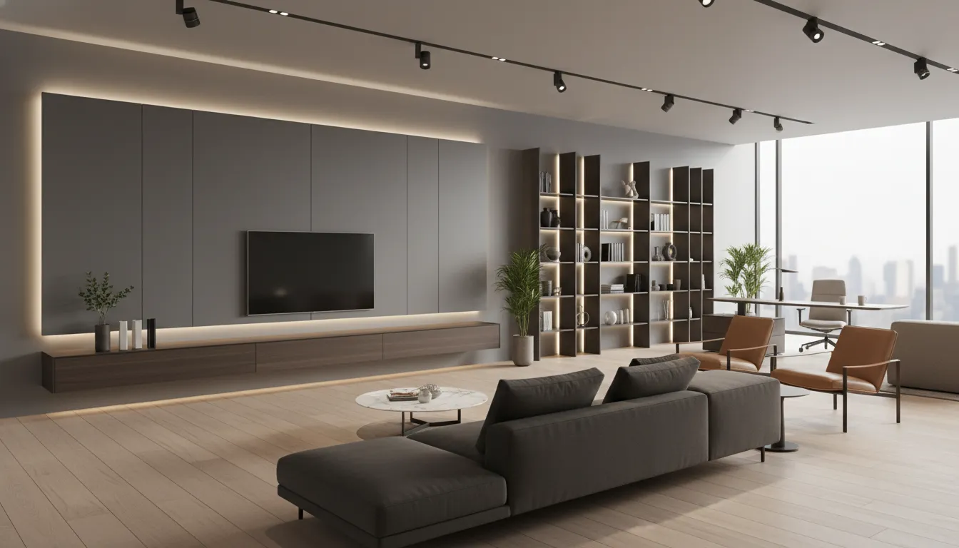
- The 70% Dominant Surface: This is typically the quiet, anchoring material. In most modern applications, a matte PET finish takes this role. It absorbs light, softens the acoustics of a room visually, and provides a vast, uninterrupted canvas.
- The 30% Accent Surface: Here is where the texture lives. Wood laminate or wood grain PET film is deployed strategically to draw the eye, highlight an architectural feature, or bring tactile warmth to interaction points.
How this rule manifests across furniture categories:
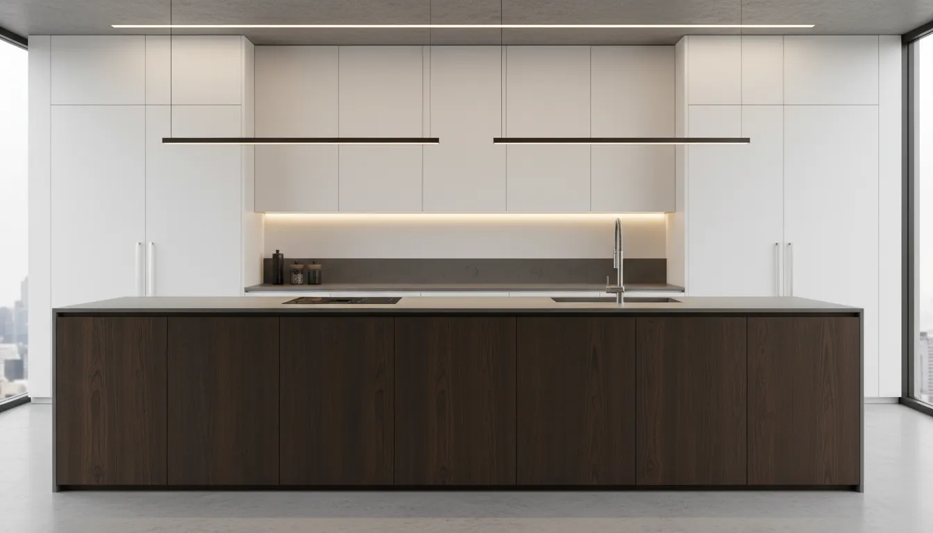
- Two Tone Kitchen Cabinets: Designers frequently anchor the space with 70% solid color on the expansive upper cabinets and tall pantry walls, while applying 30% wood grain to the base cabinets or the central kitchen island to ground the design.
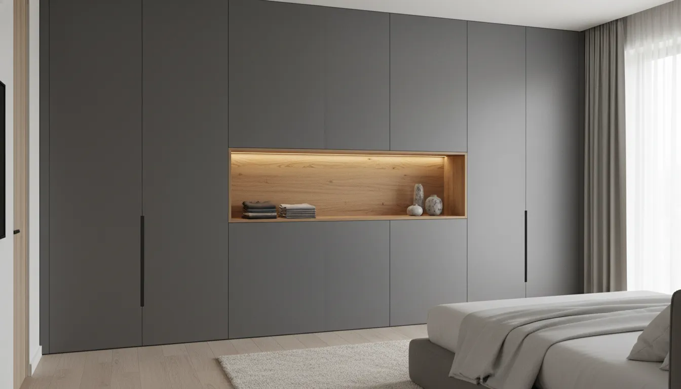
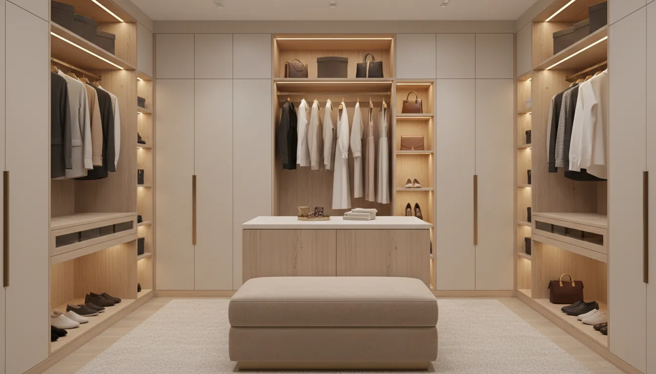
- Wardrobes: A dominant solid color encompasses the main doors, while a recessed wood grain niche acts as an elegant valet station or vanity.
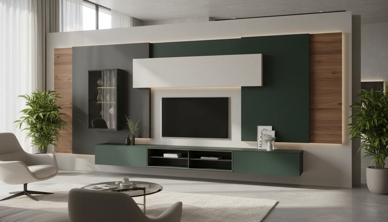
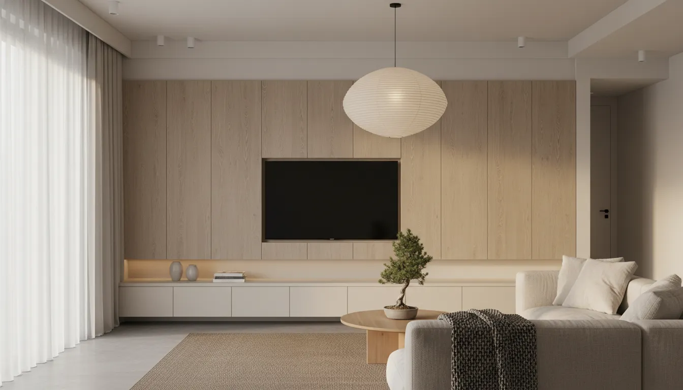
- Living Room Cabinetry: Floating media consoles wrapped in a rich wood texture and matte finish, set against a predominantly solid-color paneled wall.
Texture Creates More Luxury Than Color
In luxury cabinet design ideas, color is secondary to tactile experience. The way a surface reflects light and responds to the human touch defines its market positioning.
Historically, high-gloss surfaces dominated modern interiors. However, as any furniture surface material supplier knows, high-gloss finishes are highly prone to showing fingerprints, creating a chaotic, unkempt appearance in high-traffic areas. The industry's rapid pivot to ultra-matte surfaces was a direct response to this limitation.
A high-quality matte PET finish is engineered to absorb light, offering a velvet-like appearance that completely alters the geometry of a cabinet door. More importantly, advanced PET decorative films incorporate anti-fingerprint technology. This functional performance ensures that the crisp, clean lines of a solid color surface remain pristine, maintaining the exact textural contrast intended by the designer. When this flawless, soft-touch solid surface is juxtaposed with the synchronized, deep-embossed ridges of a wood grain PET film, the resulting texture contrast in interior design communicates an undeniable premium material feel.
Four Material Pairings That Are Dominating New Projects
Successful material combinations rely on precise color temperature and contrast matching. Here are four pairings that top-tier furniture manufacturers are scaling for 2026.
Case 1: Oak Wood Grain + Warm White Matte PET
- Emotional Impact: Calm, restorative, and expansive.
- Application Scenarios: Japandi furniture design and Scandinavian-inspired residential projects.
- Furniture Categories: Bathroom vanities, minimalist wardrobes, and light-filled coastal kitchens.
- Surface Material Recommendations: A desaturated, linear oak grain paired with a slightly warm, cream-toned white PET. Avoid stark, hospital-white solids, which clash with the organic warmth of the oak.
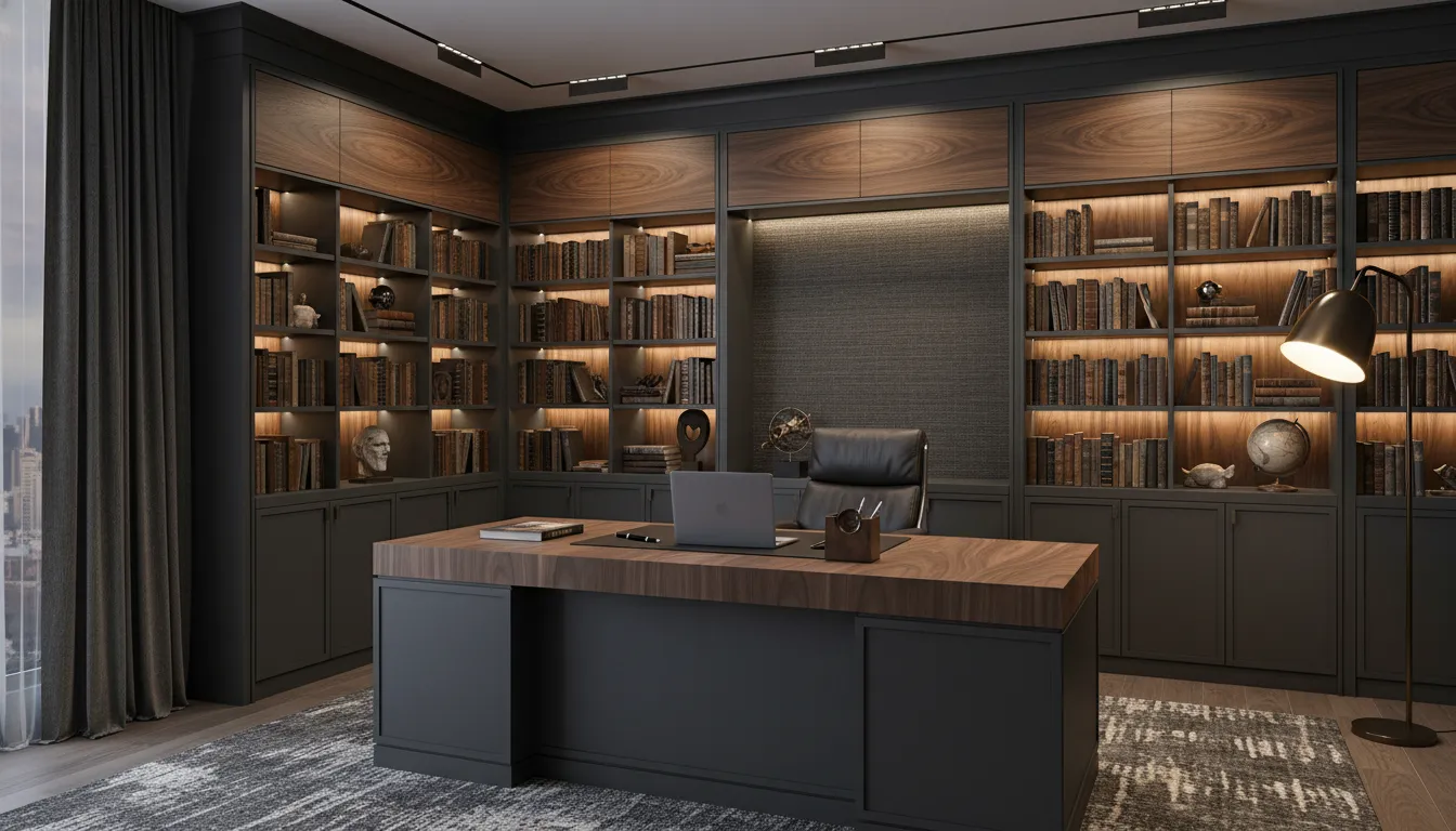
Case 2: Walnut Wood Grain + Graphite Grey PET
- Emotional Impact: Masculine, executive, and deeply sophisticated.
- Application Scenarios: Urban penthouses, executive offices, and luxury hospitality environments.
- Furniture Categories: Library shelving, wet bars, and premium architectural wall paneling.
- Surface Material Recommendations: The rich, swirling cathedrals of a dark walnut wood grain and solid color combination require a strong counterweight. A deep graphite or charcoal PET decorative film absorbs ambient light, allowing the walnut's depth to command the room.
Case 3: Ash Wood Texture + Cashmere PET
- Emotional Impact: Soft, inviting, and effortlessly elegant ("Quiet Luxury").
- Application Scenarios: High-end multi-family housing and boutique retail displays.
- Furniture Categories: Transitional kitchen cabinetry and bespoke bedroom furniture.
- Surface Material Recommendations: Cashmere (a nuanced blend of beige and grey) is the definitive color of warm minimalist interiors. Paired with a subtle, tight-grained ash, it creates a monochromatic aesthetic that relies entirely on tactile differences rather than stark color contrast.
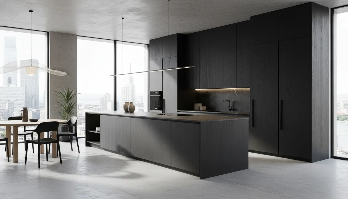
Case 4: Dark Wood Grain + Ultra Matte Black PET
- Emotional Impact: Dramatic, architectural, and avant-garde.
- Application Scenarios: High-contrast contemporary architecture and modern industrial lofts.
- Furniture Categories: Statement kitchen islands and high-end retail fixtures.
- Surface Material Recommendations: This pairing demands absolute perfection in surface quality. The matte black must be an ultra-matte, highly anti-fingerprint PET laminate for cabinets. Any smudging will immediately destroy the sleek, monolithic visual intent.
What Furniture Manufacturers Are Asking For in 2026
As interior design trends 2026 take shape, the demands placed on a PET decorative film manufacturer are evolving. Cabinet brands are moving away from piecemeal sourcing and looking for holistic surface material combinations.
To achieve the seamless look required by premium modular furniture collections, manufacturers are prioritizing continuous roll materials. While 0.8mm thick sheets have their place, roll-based PET furniture surface materials allow for efficient, large-scale continuous lamination. This manufacturing efficiency is crucial when producing expansive two-tone furniture systems where edge-banding and surface continuity must be flawless.
Furthermore, wholesale PET decorative film buyers are increasingly requesting curated "pairing collections." Rather than buying wood grains and solid colors in isolation, a forward-thinking PET cabinet film supplier now offers pre-tested, harmonized combinations that guarantee exact sheen matching and color-temperature alignment.
Beyond Color Matching — The Future Is Material Layering
The evolution of cabinet surfaces is no longer about finding a new color; it is about engineering a better tactile experience. The future of surface solutions lies in material layering—the deliberate staging of light reflection, acoustic softening, and touch response.
When architects and designers select custom PET surface solutions, they are leveraging the material's inherent flexibility. A decorative film for furniture must perform mechanically on the factory floor while delivering an emotional resonance in the home. By mastering the balance between the organic unpredictability of wood grain and the engineered perfection of solid matte colors, manufacturers can elevate standard cabinetry into functional architectural art.
FAQ: Material Mixing & Cabinet Surface Design
Q: What colors work best with wood grain cabinets?
A: Warm, neutral solids generally perform best. Cashmere, warm white, graphite, and ultra-matte black are the most reliable choices. The key is matching the color temperature: pair warm woods (like walnut) with warm solids (like cashmere), and cool woods (like weathered oak) with cool solids (like stark grey).
Q: Why are two tone kitchen cabinets so popular?
A: They solve a spatial problem. Modern kitchens are often integrated into living spaces. A two-tone approach breaks up the visual bulk of cabinetry, preventing the kitchen from feeling overwhelmingly heavy while allowing designers to introduce warmth without sacrificing a clean, contemporary aesthetic.
Q: How do designers combine wood grain and solid colors?
A: Designers rely on the 70/30 rule to maintain material hierarchy. They typically use the solid, matte color as the dominant backdrop (70%) to absorb light and create clean lines, reserving the wood grain (30%) for focal points, islands, or base cabinets to ground the design.
Q: Is matte PET suitable for modern kitchens?
A: Yes. In fact, it is the preferred material for premium modern kitchens. Advanced matte PET finish technology is highly resistant to fingerprints, scratches, and UV fading. Unlike outdated high-gloss surfaces, matte PET provides a luxurious, soft-touch feel that is highly durable and easy to maintain.
Q: What is the best PET finish for minimalist interiors?
A: For minimalist spaces, an ultra-matte, anti-fingerprint solid color PET film is ideal. Minimalist design relies on uninterrupted lines and flawless surfaces; the light-absorbing qualities of a high-quality matte finish conceal surface imperfections and reduce visual noise.
Q: How can PET decorative films improve furniture aesthetics?
A: PET films allow manufacturers to achieve the exact look and tactile feel of premium painted finishes and rare natural woods without the environmental inconsistencies or manufacturing bottlenecks of those traditional materials. They provide flawless color consistency, perfect sheen control, and the ability to seamlessly execute sophisticated two-tone designs at a commercial scale.
 Same-Color Edge Banding Systems: Achieving 100% Visual Integration