


 Home
Home2026 Global Home Color Trends Report
 02 Apr,2026
Opening Perspective: A Shift Toward Sensory Surfaces
The specification of interior spaces is undergoing a fundamental chromatic shift. Moving into 2026, the global design language is stepping away from purely visual color application toward a deeply integrated, multi-sensory approach. Color can no longer be evaluated in isolation; it must be measured by how it interacts with light, shadow, and physical touch. For the B2B sector, this means the 2026 interior surface material forecast is defined by tactility just as much as pigment.
Consumers and designers are seeking environments that provide psychological grounding. High-gloss, clinical finishes are rapidly losing market share to light-absorbing, low-sheen surfaces that emulate natural materials. This evolution demands that furniture manufacturers, cabinet producers, and interior designers rethink their material portfolios. The upcoming decorative surface trends 2026 highlight a convergence of advanced polymer technology with organic aesthetics, creating surfaces that look like natural stone, raw timber, or spun fabric, while delivering commercial-grade durability.
Key Color Directions for 2026
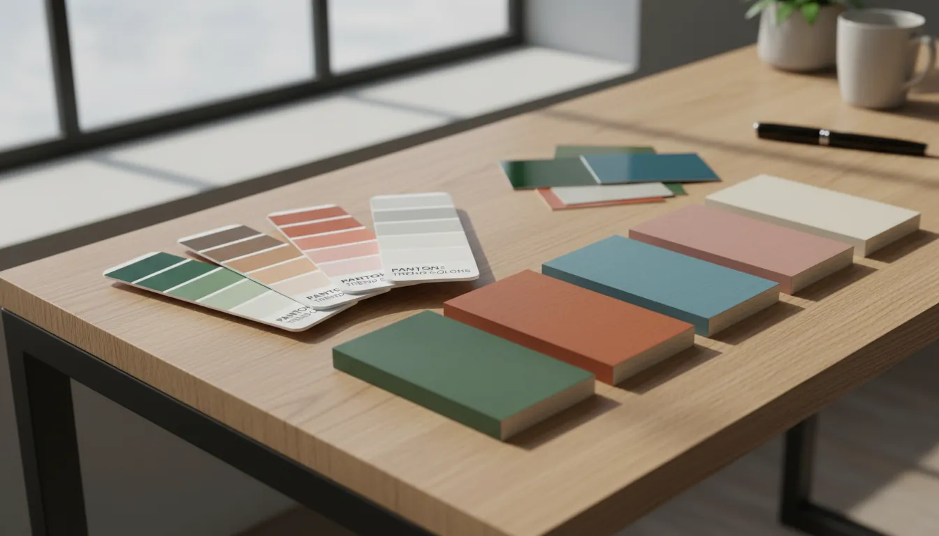
The modern interior color palette 2026 is anchored in four distinct macro-directions. Each palette is driven by shifting consumer lifestyles and requires specific surface finishes to achieve its full commercial potential.
Warm Neutrals and Soft Earth Tones
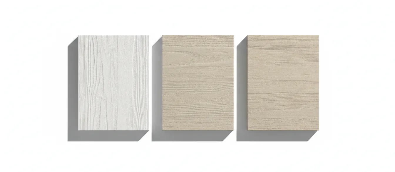
The dominant baseline for residential and commercial interiors continues to warm up, firmly rejecting the sterile, cool greys of the previous decade. The 2026 spectrum embraces baked clays, unbleached cotton, warm cashmere, and muted terracotta. These tones evoke a sense of heritage, warmth, and sanctuary.
Commercially, these hues are the safest yet most profitable foundational colors for large-scale production. When evaluating trending PET panel colors 2026, buyers are heavily indexing toward these sun-baked neutrals. However, the success of a warm neutral relies entirely on its finish. A flat, standard gloss can render these colors dated. To modernize them, manufacturers must utilize ultra-matte or soft-touch finishes. The microscopic surface texture of an ultra-matte film absorbs light, giving an ordinary beige or warm taupe a deep, velvet-like sophistication that elevates the perceived value of the final furniture piece.
Muted Greens and Organic Shades
Biophilic design has matured from a micro-trend into a permanent architectural staple. In 2026, the green palette is shifting away from bright, artificial emeralds toward complex, desaturated botanicals. Key shades include silvered sage, muted eucalyptus, dried lichen, and deep olive.
These organic shades reduce visual fatigue and blur the boundary between indoor and outdoor environments. In application, these greens pair exceptionally well with honed surfaces and woodgrain textures. A muted olive cabinet door finished with a subtle, tactile woodgrain embossing creates an authentic, nature-mimicking experience. This specific pairing is expected to dominate mid-to-high-end residential cabinetry and modular shelving systems.
Deep Textured Dark Tones
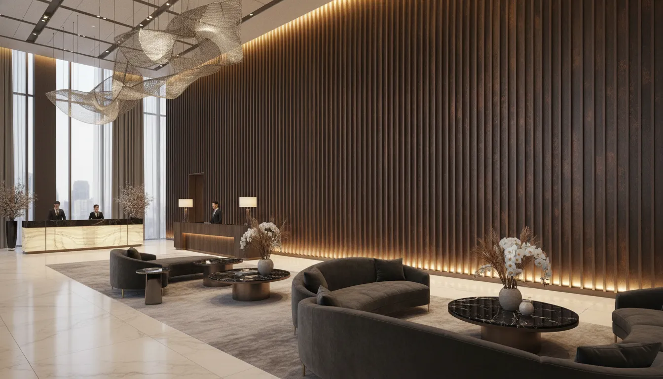
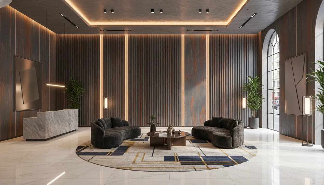
Dark spaces are being reimagined as intimate, restorative environments rather than simply dramatic accents. The 2026 dark palette includes charred walnut, oxidized iron, deep midnight navy, and smoked espresso. These colors communicate luxury, permanence, and quiet opulence.
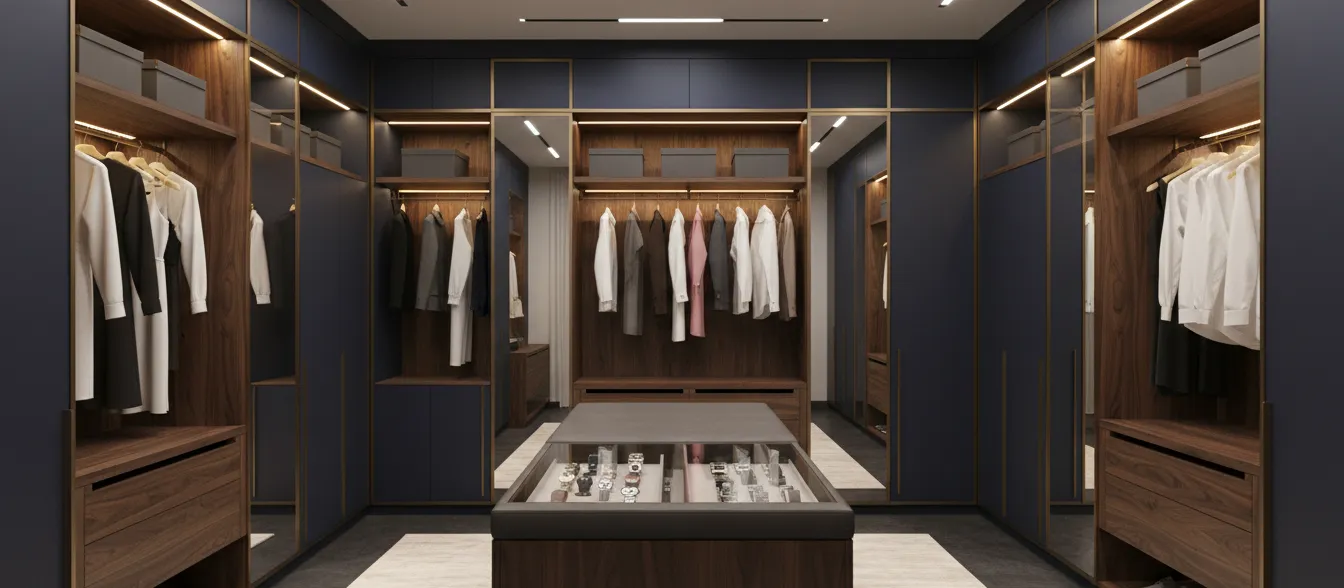
Executing dark tones in furniture manufacturing presents unique challenges, primarily regarding light reflection and fingerprint visibility. The integration of anti-fingerprint, soft-touch technology is non-negotiable here. A deep, ultra-matte charcoal surface absorbs ambient light, preventing the harsh glare that typically ruins the illusion of depth in dark interiors. This pairing is heavily specified in luxury wardrobe systems and executive commercial furniture.
Light Minimalist and Clean Palettes
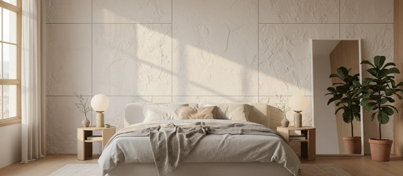
Minimalism remains a powerful commercial driver, but it has evolved into a "warm minimalism." Pure, clinical whites are being replaced by alabaster, chalk, and tinted oat. These light tones are designed to reflect natural daylight gently, making spaces feel expansive yet inviting.
To prevent light palettes from feeling synthetic or cheap, the surface material must provide subtle visual interest. Light minimalist colors require honed finishes or ultra-fine stipple textures. These microscopic variations in the surface catch the light differently at various angles, giving a simple white panel the nuanced appearance of natural plaster or limestone.
Material & Finish Integration in 2026
Analyzing the upcoming furniture color trends 2026 reveals that hue alone is insufficient for product differentiation. The physical finish of the material dictates the psychological impact of the color.
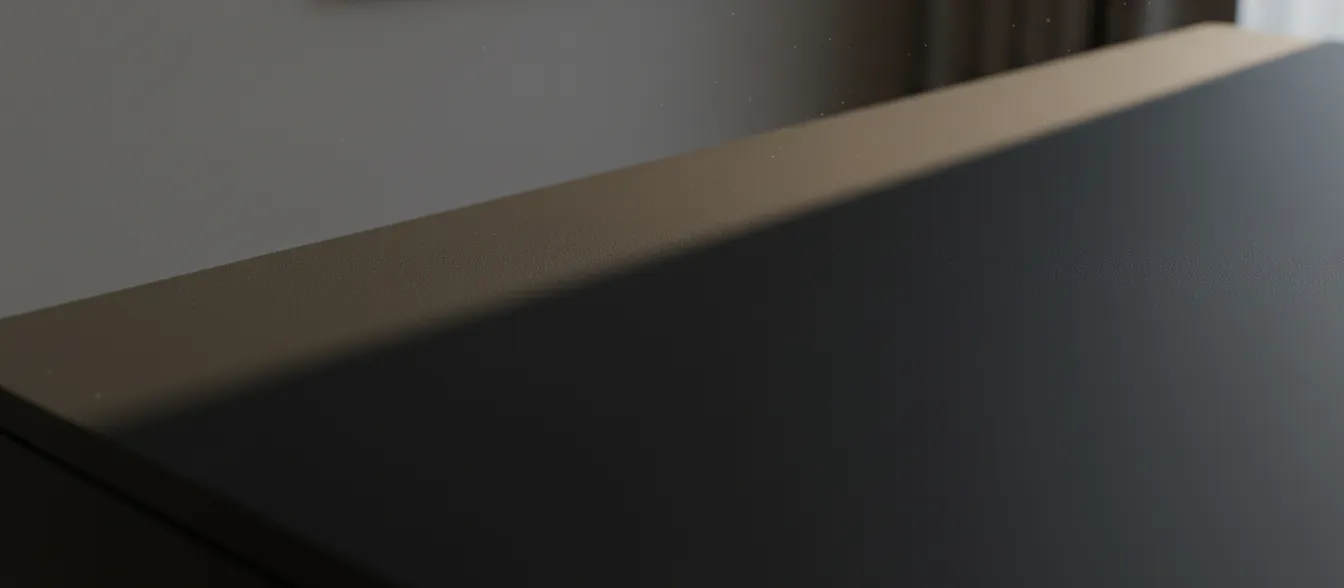
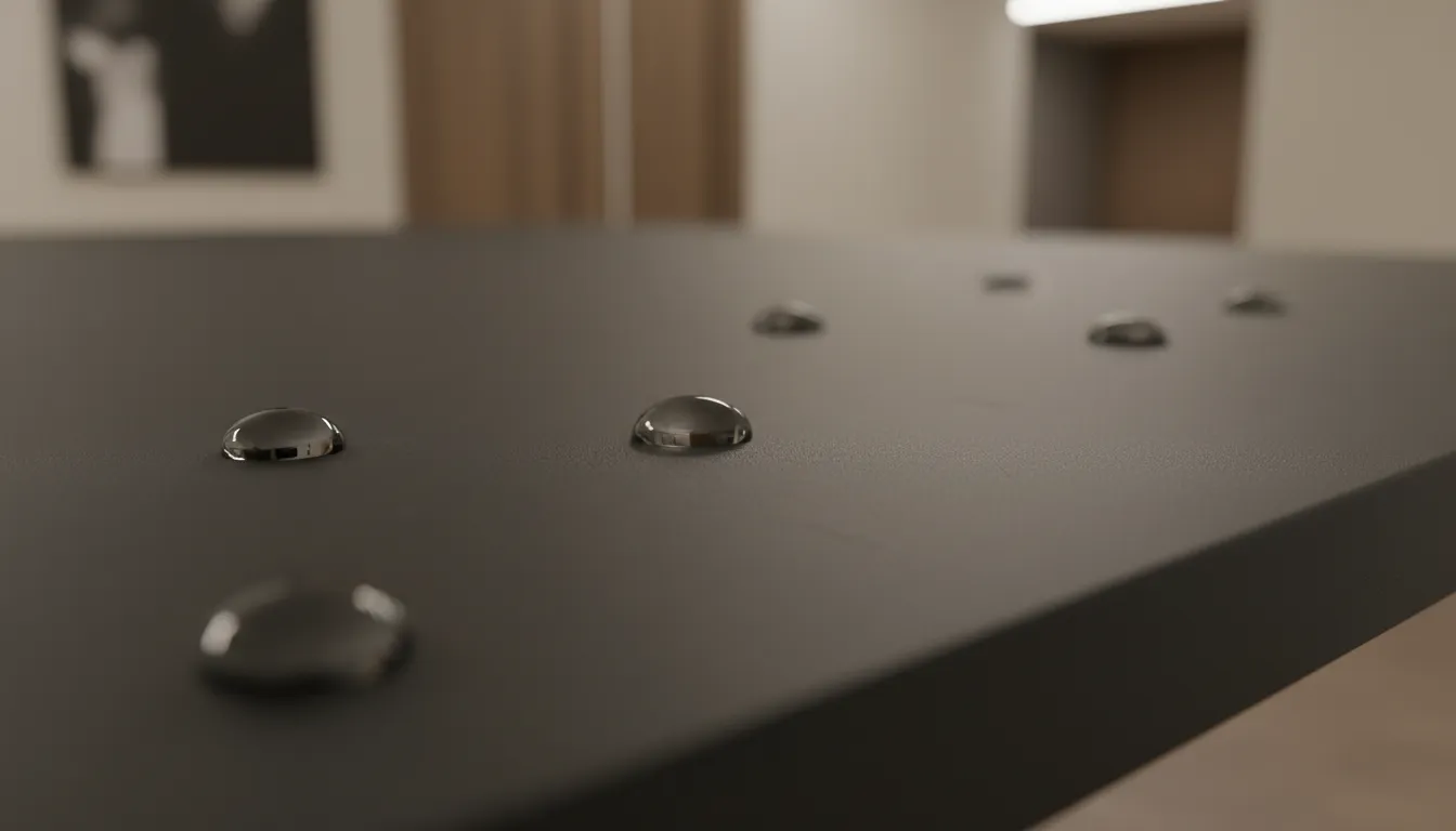
- Matte vs. Ultra Matte: Standard matte provides a low-reflection surface, but ultra-matte utilizes advanced micro-structures to diffuse light completely. Ultra-matte is essential for deep darks and warm neutrals, providing a sophisticated, light-absorbing quality that mimics natural raw materials.
- Soft-Touch Surfaces: Beyond visual light diffusion, soft-touch finishes offer a tactile elasticity. They feel warm and smooth to the hand, similar to cured leather or velvet. This finish is a massive value-add for high-interaction surfaces like cabinet doors and drawer fronts.
- Honed and Woodgrain Textures: Precision embossing technology allows decorative films to carry realistic, synchronized textures. A honed finish provides the subtle grit of natural stone, while deep woodgrain textures give organic colors the authentic grain patterns of raw timber, crucial for the muted green and dark tone palettes.
Application Insights Across Furniture Segments
Understanding how these colors and finishes translate to specific product categories is vital for manufacturers planning their production runs and inventory.
Kitchen Cabinet Wrapping Film Trends
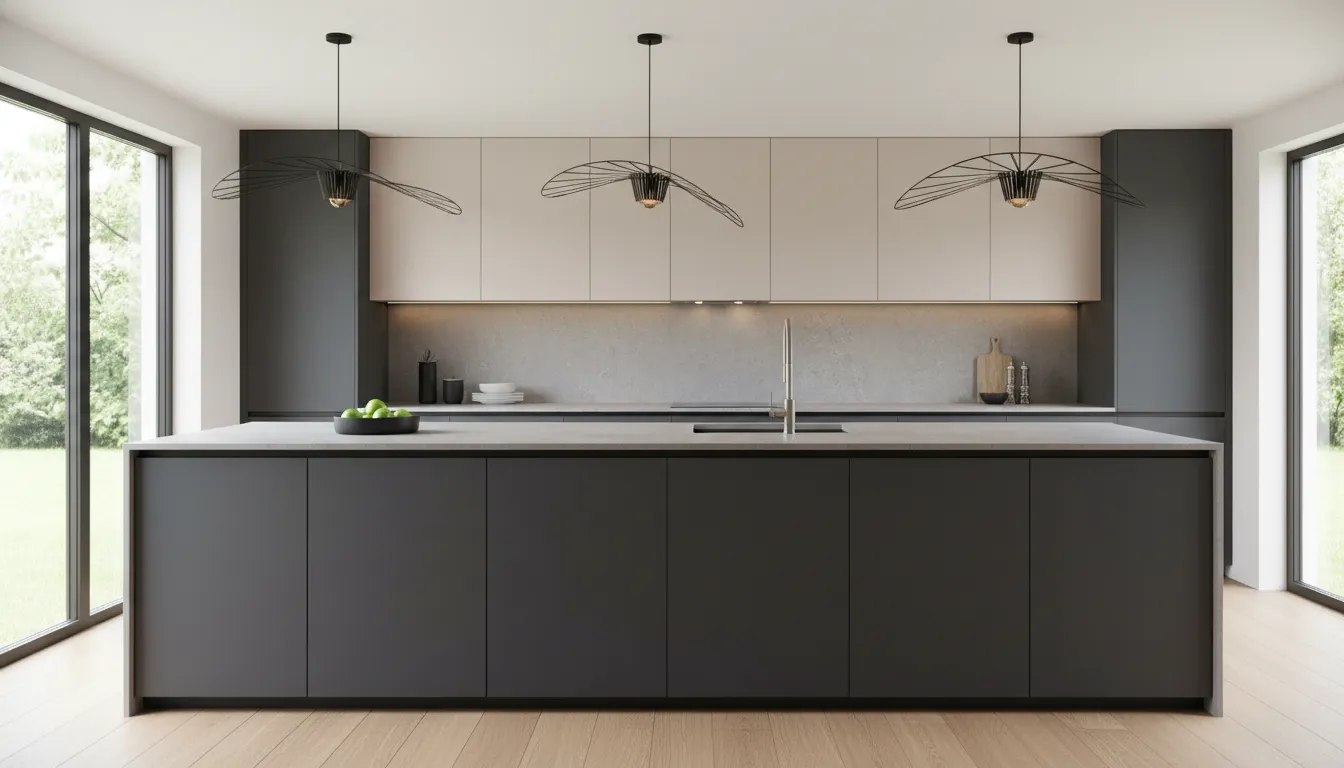
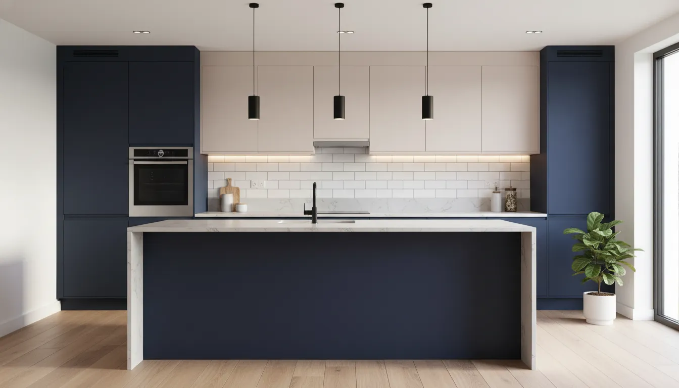
The kitchen remains the focal point of interior investment. The 2026 kitchen cabinet wrapping film trends indicate a strong pivot toward two-tone installations. Warm neutrals (like cashmere or oat) are frequently specified for upper cabinets, utilizing light-reflecting ultra-matte finishes to maintain an open feel. Lower cabinets and kitchen islands are anchoring the space with muted greens or deep dark tones.
Because kitchens are high-traffic, high-touch zones, the cabinet color trends 2026 are inextricably linked to material performance. Soft-touch, anti-fingerprint PET films are the primary specification for these environments, ensuring that the dark and organic colors maintain their pristine appearance despite heavy daily use.
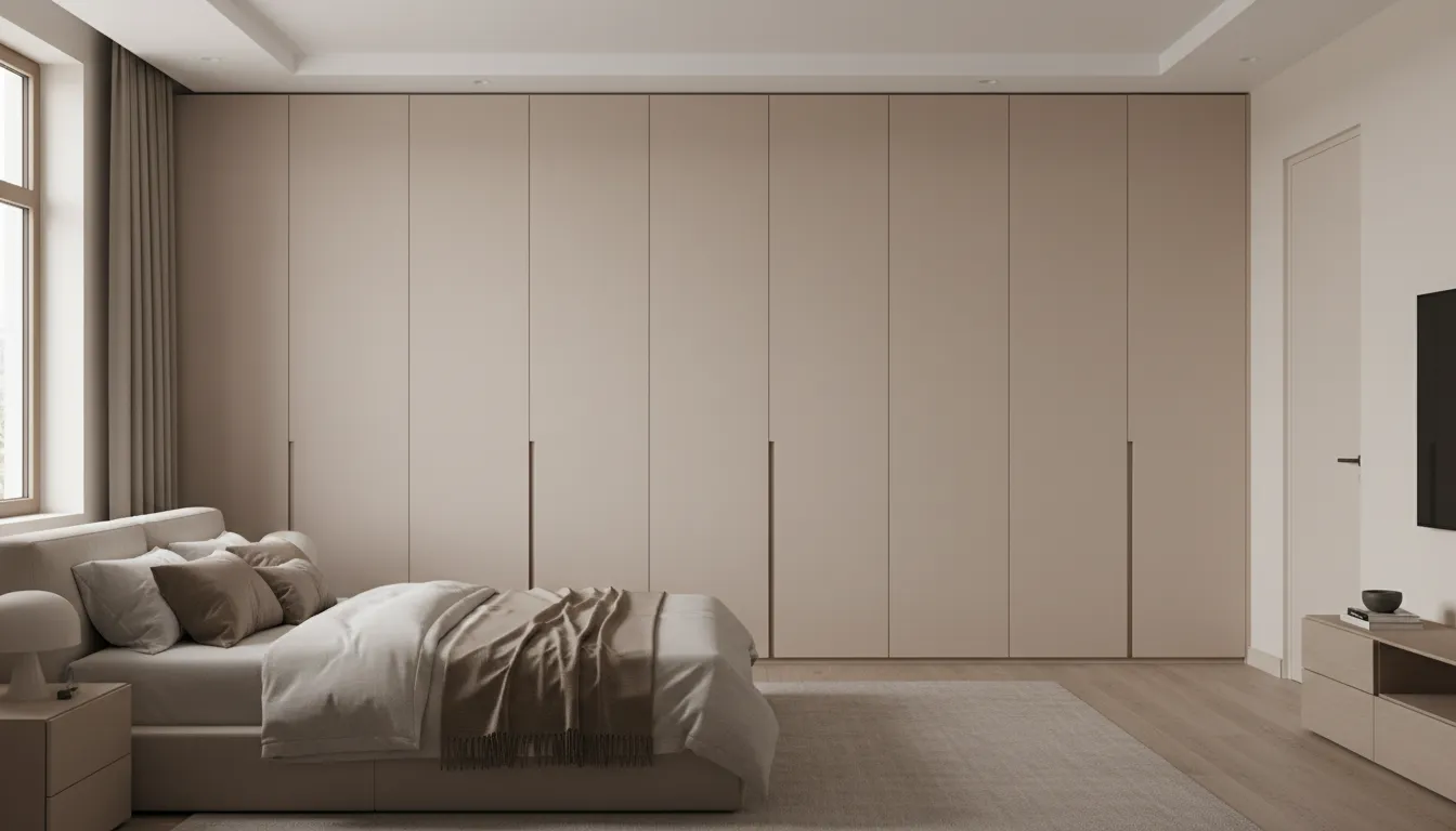
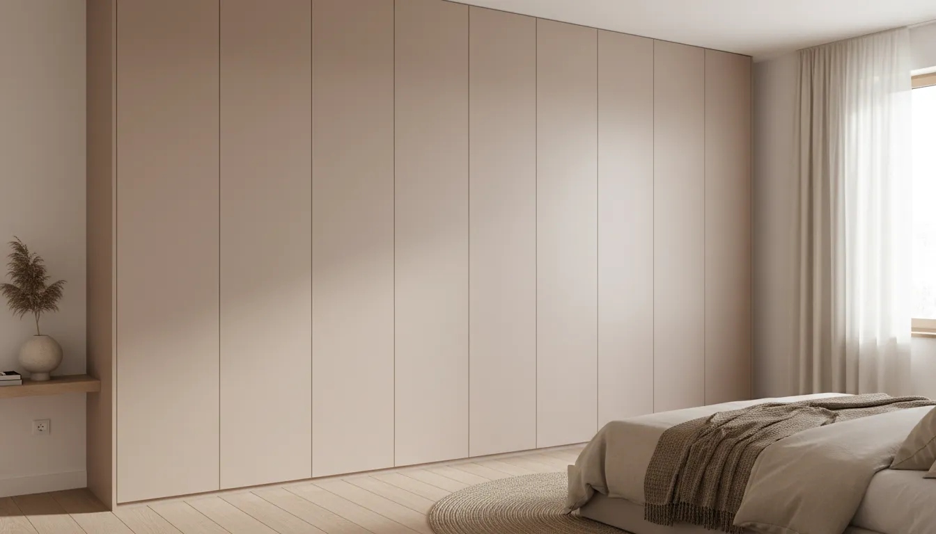
Wardrobe Panels and Furniture Surfaces
Bedroom and storage design prioritize calm and acoustic dampening. The color trends for modern wardrobe panels lean heavily into the warm neutral and light minimalist palettes. Large, unbroken expanses of wardrobe doors require surfaces that do not overwhelm the space with glare. Ultra-matte and soft-touch PP and PET films in shades of plaster, clay, and warm white are highly sought after. These finishes soften the visual weight of large furniture pieces, making massive storage walls feel like integrated architectural elements rather than bulky additions.
Feature Wall Panels and Commercial Interiors
Commercial spaces, including hospitality and corporate environments, use large-scale paneling to establish brand identity and atmosphere. The feature wall panel color forecast 2026 highlights deep textured darks and complex organic greens. Hotels and modern offices are specifying fluted or slatted wall panels finished in oxidized iron or smoked woodgrain.
The commercial interior panel finishes 2026 demand high durability alongside high design. Advanced decorative films provide the required impact resistance while delivering the nuanced, low-sheen colors that commercial architects are currently writing into their specifications.
Regional and Market Influences
Global color adoption is not uniform, though macro-trends influence all regions. The European market, heavily influenced by Japandi (Japanese-Scandinavian) design, is aggressively driving the demand for light minimalist palettes paired with subtle woodgrain textures. The North American market is showing a strong appetite for the deep textured darks and muted greens, utilizing them in large-scale residential renovations and transitional interior styles. The Middle Eastern and Asian markets are rapidly shifting from high-gloss luxury toward the quiet luxury of ultra-matte warm neutrals. Understanding these regional biases is critical for international distributors managing their inventory.
What This Means for Manufacturers and Buyers
For supply chain managers, product developers, and distributors, these aesthetic shifts require proactive adjustments. Analyzing the wholesale furniture laminate trends, there is a clear mandate to phase out legacy high-gloss foils and heavily saturated, artificial colors.
The most competitive B2B decorative panel color palettes for the upcoming cycles will be curated around tactile, low-sheen options. Buyers should focus their sourcing efforts on materials that offer a combined solution: accurate trend colors (warm neutrals, organic greens) paired with advanced surface engineering (soft-touch, anti-fingerprint, ultra-matte). Stocking a color is no longer enough; stocking the right finish of that color dictates market success.
Translating Trends into Real Products
The gap between trend forecasting and commercial manufacturing is bridged by advanced material solutions. To capitalize on the 2026 color directions, manufacturers need reliable substrates and decorative surfaces that can be seamlessly integrated into existing production lines without sacrificing aesthetic quality.
This is where specialized material engineering becomes the manufacturer's greatest asset. WellP provides the crucial link between these global design trends and the factory floor. By developing highly engineered PET and PP decorative films, WellP allows furniture and cabinet producers to execute the 2026 color palette with exact precision. Whether a design calls for an ultra-matte Cashmere for modern wardrobes, a soft-touch Smoked Eucalyptus for kitchen cabinetry, or a deeply textured woodgrain for commercial wall panels, WellP's surface materials deliver both the critical aesthetic finish and the commercial-grade durability required by modern B2B buyers.
Conclusion: From Color to Surface Experience
The impending design year redefines how the industry views surface materials. Color is the initial hook, but the tactile finish is the lasting experience. By aligning product development with these four core color directions—and demanding the ultra-matte, soft-touch, and textured finishes required to elevate them—manufacturers and designers can create interior products that resonate with the evolving, sensory-driven demands of the 2026 global market.
 Opening Insight: A Reshaping Supply Chain Landscape